- Information
- AI Chat
Was this document helpful?
Sig assingment - Study material for classes at CPCC.
Course: Statistical Methods I (MAT 152)
19 Documents
Students shared 19 documents in this course
University: Central Piedmont Community College
Was this document helpful?

MAT 152 Signature Assignment
The purposes of the project are to distinguish between quantitative and qualitative data, to demonstrate both an
understanding of the appropriate means of displaying, analyzing and interpreting statistics on each type, and the
appropriate use of technology to produce a report of the findings.
Project Outline
1. Pick a meaningful survey topic that can be investigated by asking people in your surroundings (students, coworkers,
neighbors, etc.). Identify and explain how the sample was selected. You must survey at least 30 people.
2. Your survey must contain 3 questions:
a. 1 question that has a qualitative (word) response. The question needs to have at least 4 responses. Yes/no
questions are not accepted.
b. 2 questions that give a quantitative (numeric) response that you think may have a relationship.
3. You must get your instructor to approve the survey.
4. Collect and compile the data.
The report you submit must include the following:
5. An introduction, explaining what topic is being investigated and how the survey was conducted. Identify and explain
how the sample was selected. Is it biased?? If so, why? How could you have taken a better survey?
Open your Excel document with your data results in the first three columns. Be sure to include proper headings.
6. Important: Using Excel (Strongly suggest printing labs 2 through 4 for guidance.)
PART A. For the qualitative data
1. Create a frequency table
2. Create a pie chart and a Pareto chart
3. Write a conclusion. This should include but is not limited to discussing the qualitative data charts and
graphs, stating the mode, and any interesting finds in your data.
PART B. For the quantitative data. Pick one of your quantitative data questions. Create the following tables/graphs.
1. Create a histogram using between 5 and 10 classes (Visual Binning).
2. Calculate the mean, median, mode, range, standard deviation, and five number summary.
3.Create a box plot.
4. Identify any outliers.
5. Write a conclusion for this section of your data. This should include answering the following. What is
your mean and median? Based on this information is your graph skewed? Do you have any outliers,
state the value of the outliers or state that no outliers were noted, and state if you were surprised by
the outliers? What other outcomes did you find interesting from your graphs/charts.
PART C. Using both of your quantitative questions , (using lab 6 as your guide), create/answer the following:
1. Determine which one you believe to be the explanatory variable and which is the response variable.
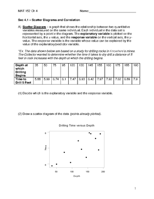
2. Construct a scatterplot
3. Graph the best fit line on the scatterplot
4. Find the correlation coefficient
5.Determine the regression equation of the best fit line
6. Write a conclusion. This should include but is not limited to stating the explanatory and response
variables, stating whether there is a linear correlation and what that r value is, and whether that is what
you expected. Also state what the least squares regression line is and explain the meaning of the slope
and y-intercept mean in this situation. Also interpret the y-intercept or explain why it could not be
possible. State other things that you found interesting from the results of your two quantitative
questions. Make a prediction about what you expect to happen in the future based on your results.


